Client
School Project
YouTube
Role
UX/UI, Visual
Time
Spring 2020
Identifying the Task
The goal of the project was to research the most popular visual design trends used throughout modern user interfaces. Based on three trends of my choice, I was to build one moodboard highlighting key elements per each trend. Each moodboard would then be interpreted by two different UI concepts.
Analyzing Assets
To begin with, I decided to redesign the YouTube homepage according to my chosen UI trends and moodboards. In order to do so, I took into consideration several aspects of the current app, such as the style of icons, typography, color scheme, and layout.
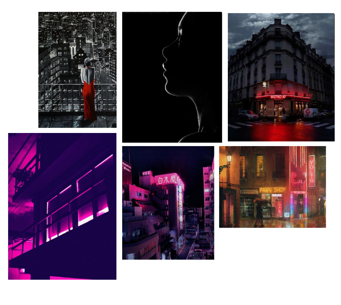
Moodboard l : Dark Theme
The first moodboard consisted of darker shades, allowing for light to be concentrated in locations of importance in order to establish visual hierarchy.
Design Iterations
Despite differences in color, font, and icon style, both concepts follow a noir-like theme and use few accent colors to light up the UI.
Moodboard ll : Minimalist
Design Iterations
Minimalism is interpreted by these concepts through simplistic color schemes, and increasing dependence on the user to recognize meaning behind icons.
Moodboard lll : Asymmetric
Design Iterations
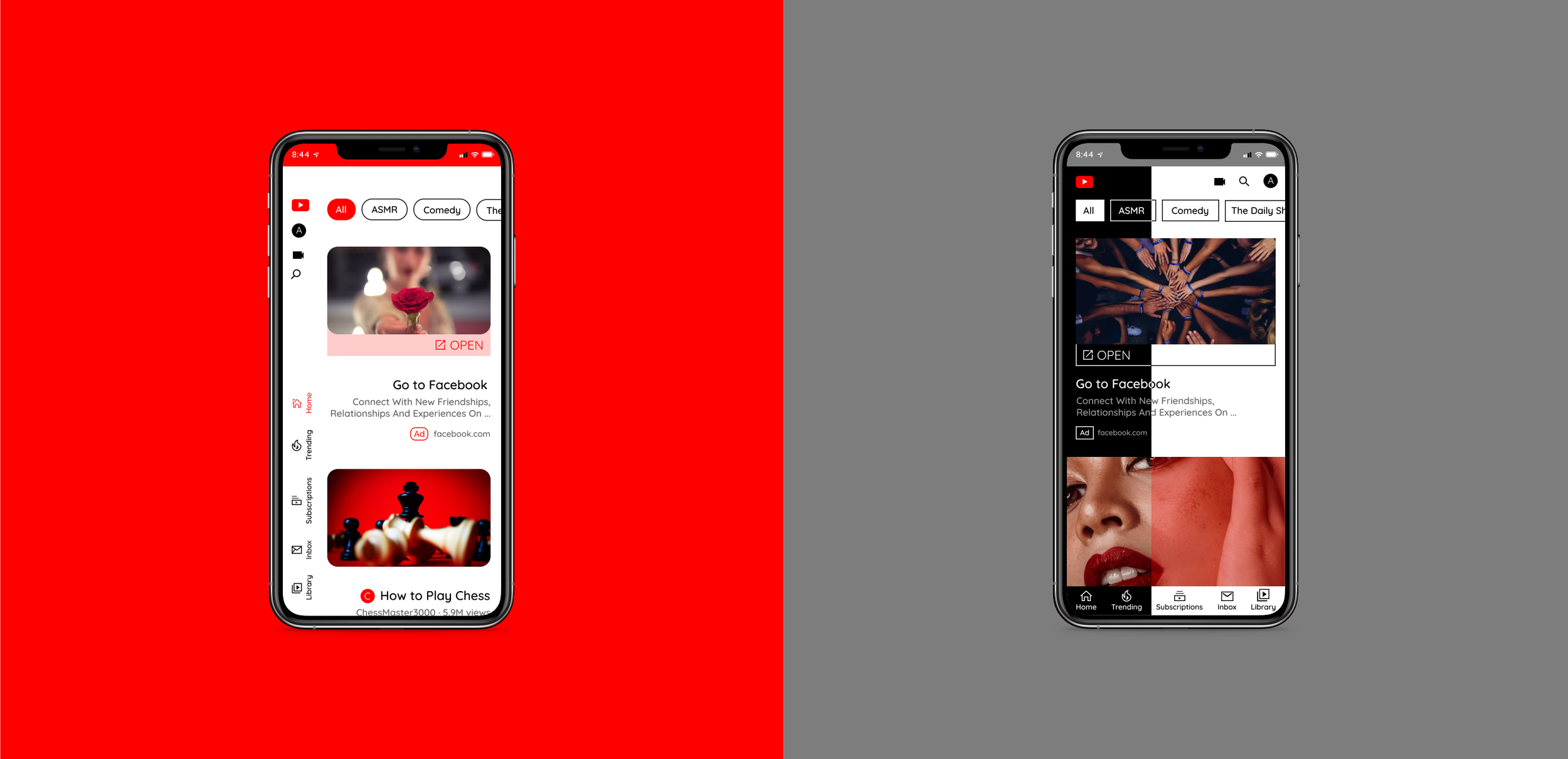
An asymmetric concept is often accompanied by a slightly off-setting feel, one that may surprise the user but also leave behind a sleek and unique interface that engages. These proposals experiment with a lack of grid-based layout and unusual arrangement. This concept may have been the most challenging for me to design, as I wanted to create an interface as usable as it was aesthetically pleasing.
Developing Final Design Comps
After further refining my iterations, I found that the most defined and developed versions of each concept served as a combination of both interpretations.


